
Kom op tegen Kanker
One design system as the foundation for a consistent digital experience

Kom op tegen Kanker is building accessible and consistent digital experiences that connect people and create social impact. As its ecosystem of websites, platforms and digital applications continued to grow, it became increasingly important to provide a recognisable and consistent user experience across all digital touchpoints.
At the same time, the organisation was working on a new brand identity and a broader digital transformation. The challenge was not only to translate the new identity visually, but also to make it scalable and consistently applicable across different digital applications.
Through a Team as a Service assignment, Lemon strengthened Kom op tegen Kanker's digital team. We worked closely with designers, service designers and colleagues from tech and data to build a design system from the ground up.

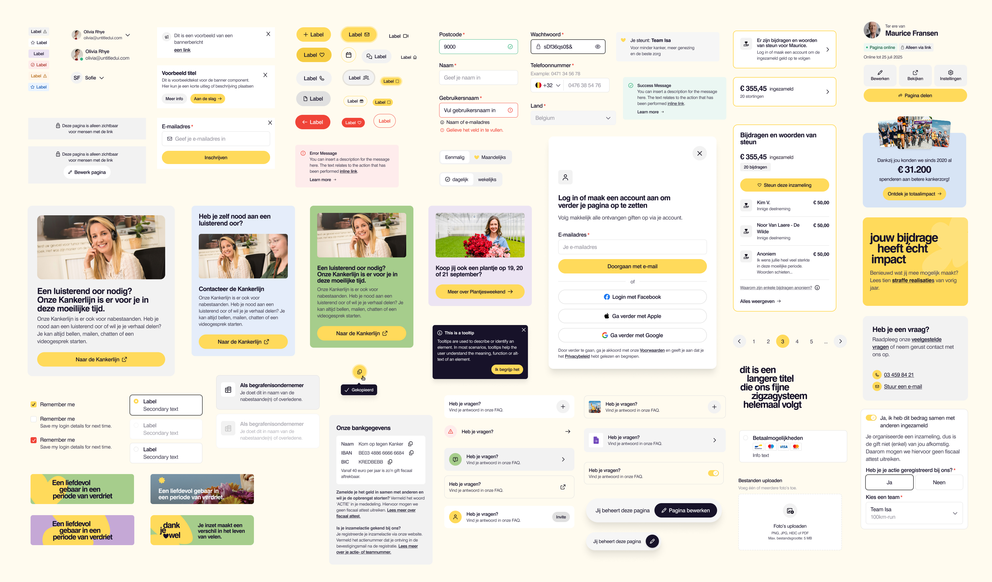

We started from a digital environment in which components and patterns across different applications did not always share the same structure, style or logic. The new branding created an opportunity not only for a visual refresh, but also to introduce greater structure, coherence and consistency based on one shared foundation.
We mapped the existing components and patterns, determined which elements could be reused and identified which building blocks were still missing. At the same time, we translated the new brand identity step by step into concrete foundations, components and patterns. This allowed the design system to evolve alongside the new branding.
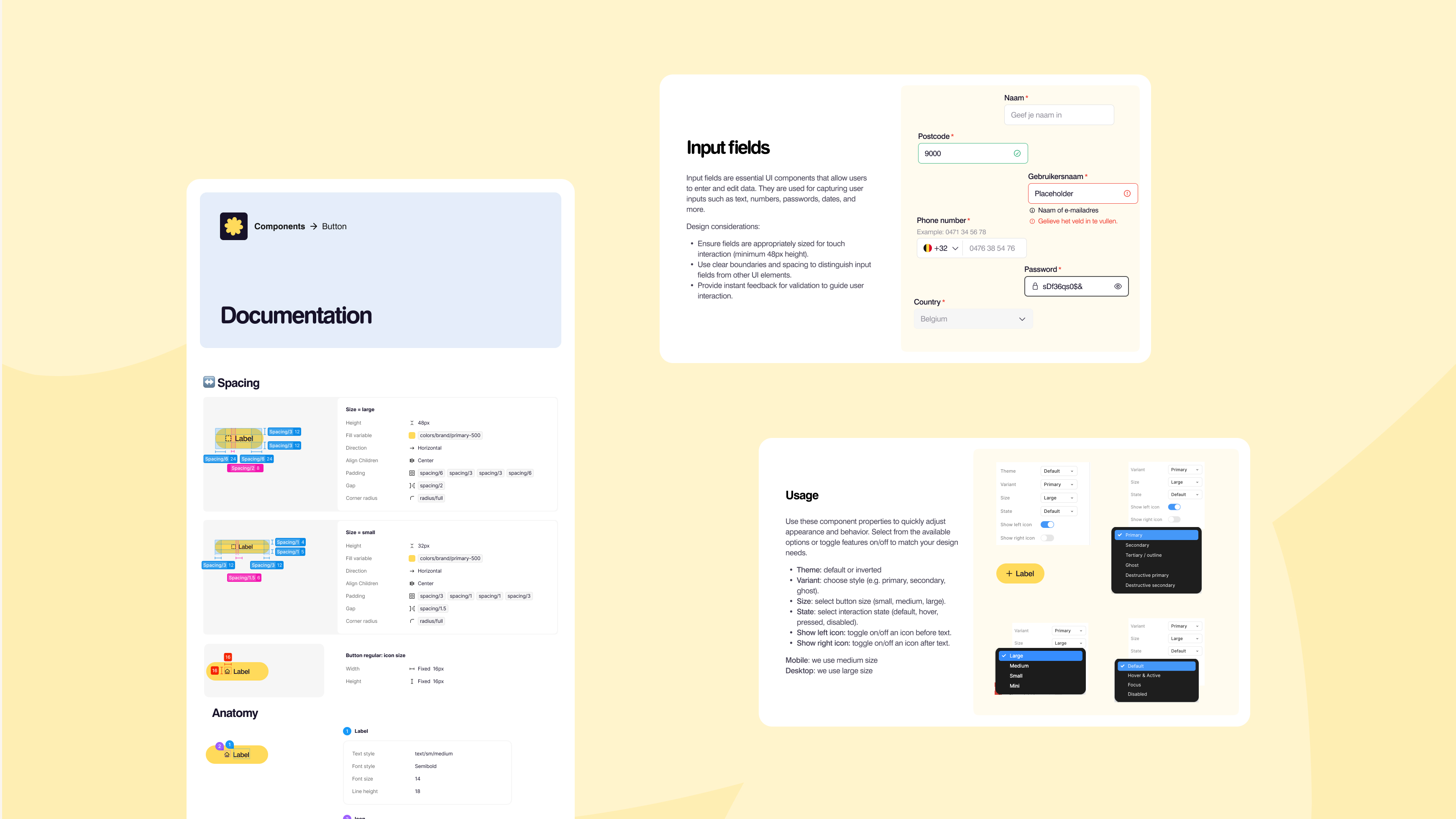
We worked according to the Atomic Design principle: from foundations such as colours, typography, icons and spacing, through reusable core components such as buttons, inputs and forms, to larger web components for navigation, footers, calls to action and content sections.
This resulted in a coherent system in which components build logically upon one another, while structurally translating the new brand identity across different digital applications.
Design and development also worked from the same foundation. The design system was built and managed in Figma, while components were documented and tested in Storybook and aligned with the technical implementation. This ensured consistency between both environments and made it possible to continuously refine the components.
The system was designed to grow with future needs. Existing components could be extended and new building blocks added, making the design system a flexible starting point for new user flows and digital requirements.
Foundations
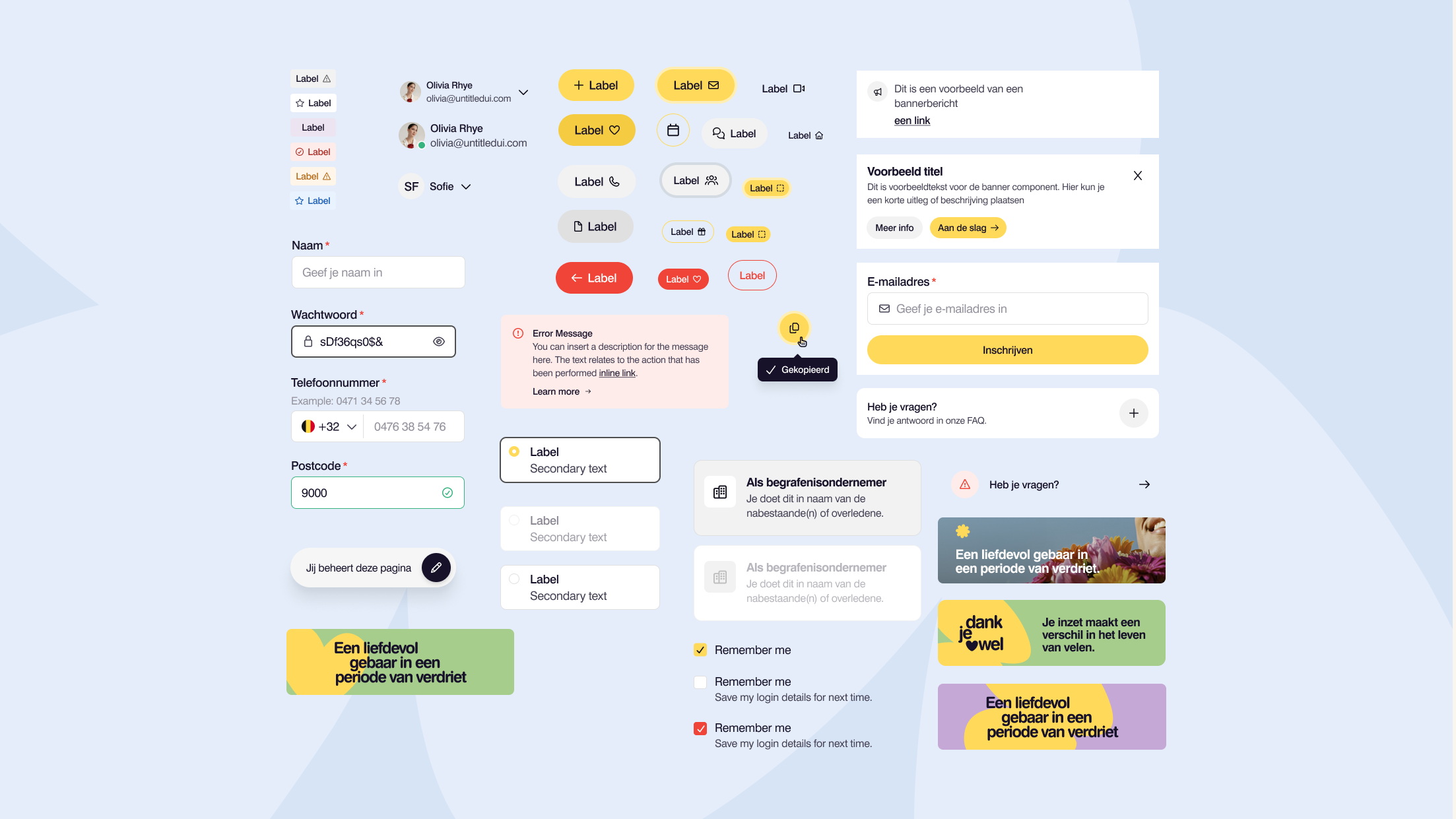
A central foundation for colours, typography, icons, spacing and other visual building blocks of the new brand identity.
Core design system
Reusable UI components such as buttons, inputs, forms and other patterns that recur across different digital applications.
Web components
Specific components for websites and digital platforms, such as navigation, footers, content sections and call-to-action blocks.

Branding as a shared foundation
The new brand identity was structurally translated into the design system, creating a consistent visual and functional foundation for different digital touchpoints, including the website, user portal, Alles over Kanker, the Kankerfonds and applications for campaigns and fundraising.
An expandable system
The design system was further expanded as new digital needs emerged. Existing components were adapted and new components were added for, among other things, the In Memoriam flow, fundraising flows, the renewed donation experience and the redesigned website.
Governance
Clear documentation, version control and shared agreements ensure that the design system remains manageable and usable for both internal teams and external development partners.
Kom op tegen Kanker now has one shared design system that structurally translates its new brand identity across its entire digital environment.
Foundations, core components and web components together form a scalable basis for the organisation's various websites, platforms and digital applications. The design system brings greater structure and consistency to the digital environment and provides teams with a shared foundation for designing and developing new applications more efficiently.
In this way, the design system forms the basis for a consistent digital experience today and for the continued digital transformation of Kom op tegen Kanker.

